
Chanel Sonbahar-Kış 2024-25 Haute Couture Defilesi

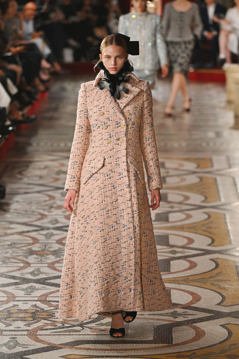
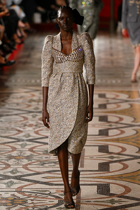
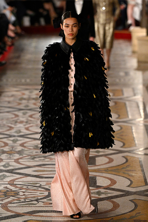
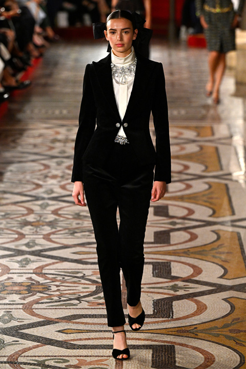
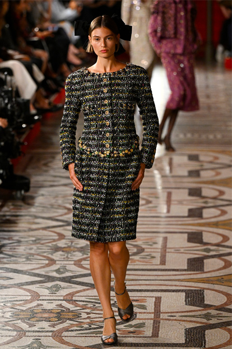
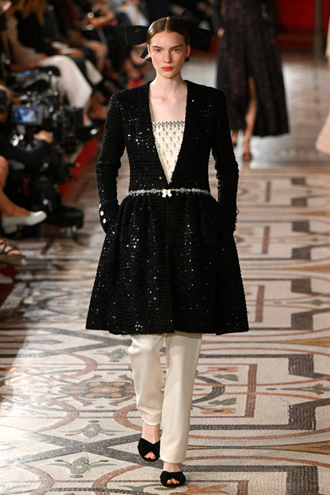
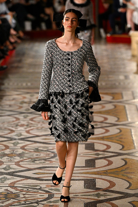
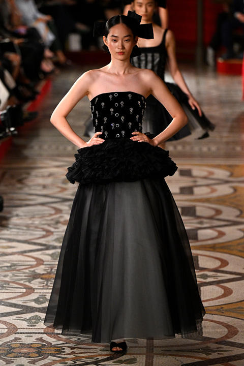
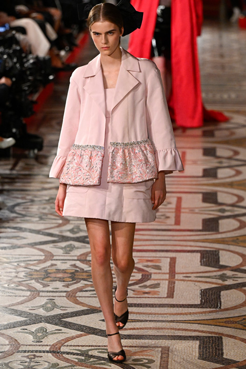
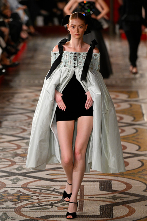
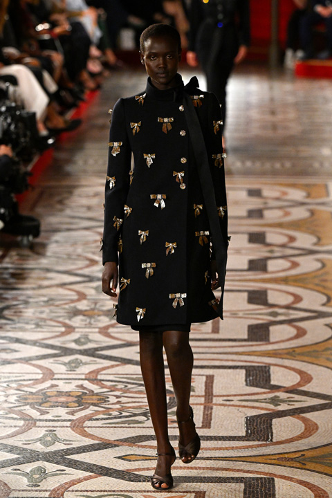
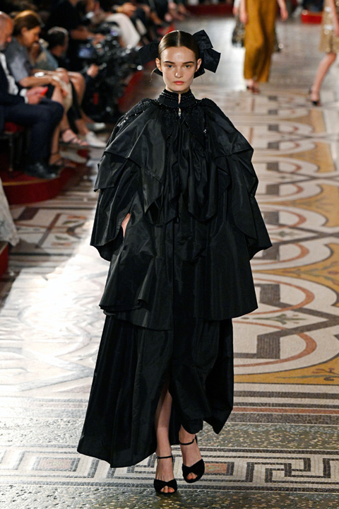
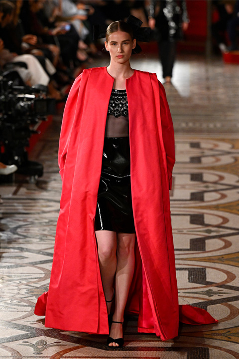
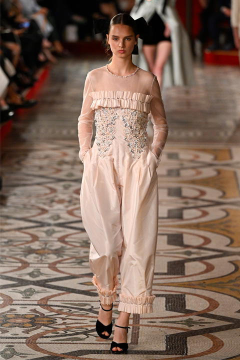
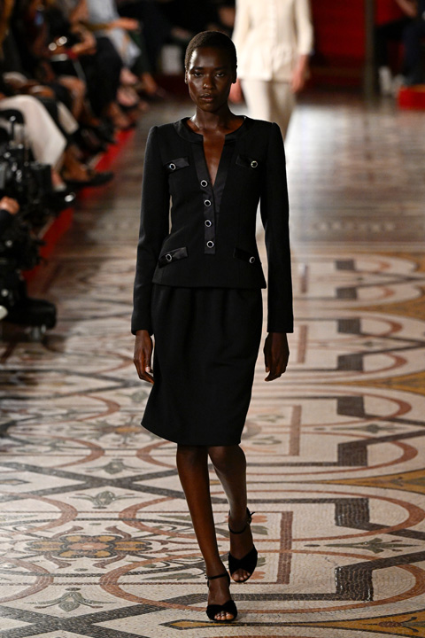
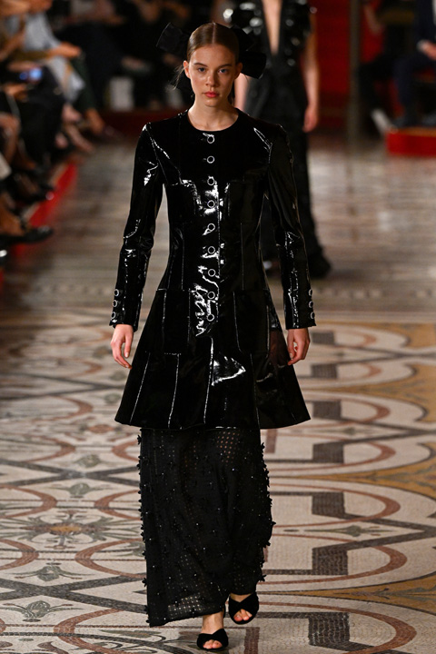
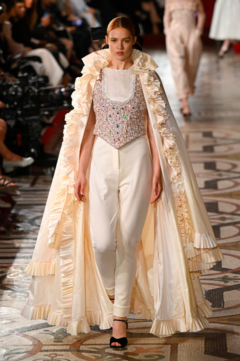
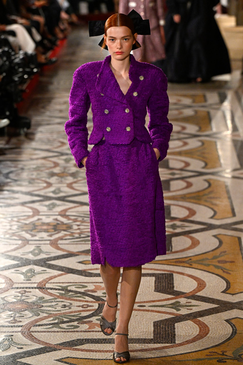
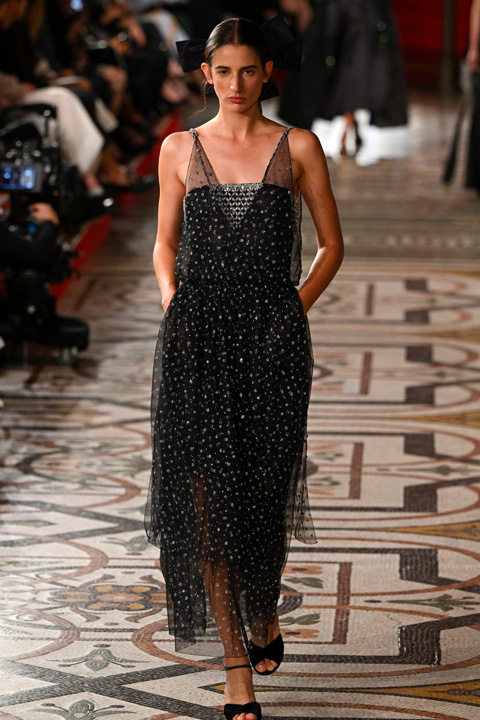
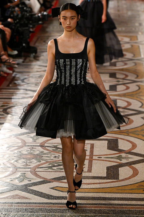
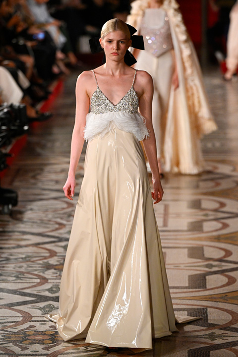
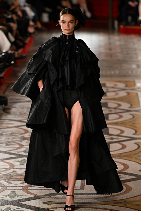
‘Fashion Creation Studio’ tarafından sunulan Chanel Sonbahar-Kış 2024/25 Haute Couture koleksiyonu, Paris’teki Palais Garnier’e saygı duruşunda bulunuyor. Sofistike, lüks, teatral olan koleksiyon, Yönetmen Christophe Honoré tarafından tasarlanan bir set içinde oditoryumu çevreleyen dış koridorlarda kendini gösteriyor.
Haute Couture ve opera dünyalarının birleştiği koleksiyonda, işlemeli çiçekler, değerli örgüler, esnek tüvitler, zengin işlemeler ve hacimli pelerinler modernize edilmiş bir sahne geleneğini çağrıştırıyor.
1/23
.circle {
position: relative;
width: 70px;
height: 70px;
cursor: pointer;
}
.circle svg {
fill: none;
stroke: #8a3ab9;
stroke-linecap: round;
stroke-width: 3;
stroke-dasharray: 1;
stroke-dashoffset: 0;
animation: stroke-draw 2s cubic-bezier(0.77, 0, 0.175, 1) infinite alternate;
display:block!important
}
.circle img {
position: absolute;
left: 50%;
top: 50%;
transform: translate(-50%, -50%);
border-radius: 50%;
}
@keyframes stroke-draw {
from {
stroke: #8a3ab9;
stroke-dasharray: 1;
}
to {
stroke: #cd486b;
transform: rotate(180deg);
stroke-dasharray: 8;
}
}
2/23
.circle {
position: relative;
width: 70px;
height: 70px;
cursor: pointer;
}
.circle svg {
fill: none;
stroke: #8a3ab9;
stroke-linecap: round;
stroke-width: 3;
stroke-dasharray: 1;
stroke-dashoffset: 0;
animation: stroke-draw 2s cubic-bezier(0.77, 0, 0.175, 1) infinite alternate;
display:block!important
}
.circle img {
position: absolute;
left: 50%;
top: 50%;
transform: translate(-50%, -50%);
border-radius: 50%;
}
@keyframes stroke-draw {
from {
stroke: #8a3ab9;
stroke-dasharray: 1;
}
to {
stroke: #cd486b;
transform: rotate(180deg);
stroke-dasharray: 8;
}
}
3/23
.circle {
position: relative;
width: 70px;
height: 70px;
cursor: pointer;
}
.circle svg {
fill: none;
stroke: #8a3ab9;
stroke-linecap: round;
stroke-width: 3;
stroke-dasharray: 1;
stroke-dashoffset: 0;
animation: stroke-draw 2s cubic-bezier(0.77, 0, 0.175, 1) infinite alternate;
display:block!important
}
.circle img {
position: absolute;
left: 50%;
top: 50%;
transform: translate(-50%, -50%);
border-radius: 50%;
}
@keyframes stroke-draw {
from {
stroke: #8a3ab9;
stroke-dasharray: 1;
}
to {
stroke: #cd486b;
transform: rotate(180deg);
stroke-dasharray: 8;
}
}
4/23
.circle {
position: relative;
width: 70px;
height: 70px;
cursor: pointer;
}
.circle svg {
fill: none;
stroke: #8a3ab9;
stroke-linecap: round;
stroke-width: 3;
stroke-dasharray: 1;
stroke-dashoffset: 0;
animation: stroke-draw 2s cubic-bezier(0.77, 0, 0.175, 1) infinite alternate;
display:block!important
}
.circle img {
position: absolute;
left: 50%;
top: 50%;
transform: translate(-50%, -50%);
border-radius: 50%;
}
@keyframes stroke-draw {
from {
stroke: #8a3ab9;
stroke-dasharray: 1;
}
to {
stroke: #cd486b;
transform: rotate(180deg);
stroke-dasharray: 8;
}
}
5/23
.circle {
position: relative;
width: 70px;
height: 70px;
cursor: pointer;
}
.circle svg {
fill: none;
stroke: #8a3ab9;
stroke-linecap: round;
stroke-width: 3;
stroke-dasharray: 1;
stroke-dashoffset: 0;
animation: stroke-draw 2s cubic-bezier(0.77, 0, 0.175, 1) infinite alternate;
display:block!important
}
.circle img {
position: absolute;
left: 50%;
top: 50%;
transform: translate(-50%, -50%);
border-radius: 50%;
}
@keyframes stroke-draw {
from {
stroke: #8a3ab9;
stroke-dasharray: 1;
}
to {
stroke: #cd486b;
transform: rotate(180deg);
stroke-dasharray: 8;
}
}
6/23
.circle {
position: relative;
width: 70px;
height: 70px;
cursor: pointer;
}
.circle svg {
fill: none;
stroke: #8a3ab9;
stroke-linecap: round;
stroke-width: 3;
stroke-dasharray: 1;
stroke-dashoffset: 0;
animation: stroke-draw 2s cubic-bezier(0.77, 0, 0.175, 1) infinite alternate;
display:block!important
}
.circle img {
position: absolute;
left: 50%;
top: 50%;
transform: translate(-50%, -50%);
border-radius: 50%;
}
@keyframes stroke-draw {
from {
stroke: #8a3ab9;
stroke-dasharray: 1;
}
to {
stroke: #cd486b;
transform: rotate(180deg);
stroke-dasharray: 8;
}
}
7/23
.circle {
position: relative;
width: 70px;
height: 70px;
cursor: pointer;
}
.circle svg {
fill: none;
stroke: #8a3ab9;
stroke-linecap: round;
stroke-width: 3;
stroke-dasharray: 1;
stroke-dashoffset: 0;
animation: stroke-draw 2s cubic-bezier(0.77, 0, 0.175, 1) infinite alternate;
display:block!important
}
.circle img {
position: absolute;
left: 50%;
top: 50%;
transform: translate(-50%, -50%);
border-radius: 50%;
}
@keyframes stroke-draw {
from {
stroke: #8a3ab9;
stroke-dasharray: 1;
}
to {
stroke: #cd486b;
transform: rotate(180deg);
stroke-dasharray: 8;
}
}
8/23
.circle {
position: relative;
width: 70px;
height: 70px;
cursor: pointer;
}
.circle svg {
fill: none;
stroke: #8a3ab9;
stroke-linecap: round;
stroke-width: 3;
stroke-dasharray: 1;
stroke-dashoffset: 0;
animation: stroke-draw 2s cubic-bezier(0.77, 0, 0.175, 1) infinite alternate;
display:block!important
}
.circle img {
position: absolute;
left: 50%;
top: 50%;
transform: translate(-50%, -50%);
border-radius: 50%;
}
@keyframes stroke-draw {
from {
stroke: #8a3ab9;
stroke-dasharray: 1;
}
to {
stroke: #cd486b;
transform: rotate(180deg);
stroke-dasharray: 8;
}
}
9/23
.circle {
position: relative;
width: 70px;
height: 70px;
cursor: pointer;
}
.circle svg {
fill: none;
stroke: #8a3ab9;
stroke-linecap: round;
stroke-width: 3;
stroke-dasharray: 1;
stroke-dashoffset: 0;
animation: stroke-draw 2s cubic-bezier(0.77, 0, 0.175, 1) infinite alternate;
display:block!important
}
.circle img {
position: absolute;
left: 50%;
top: 50%;
transform: translate(-50%, -50%);
border-radius: 50%;
}
@keyframes stroke-draw {
from {
stroke: #8a3ab9;
stroke-dasharray: 1;
}
to {
stroke: #cd486b;
transform: rotate(180deg);
stroke-dasharray: 8;
}
}
10/23
.circle {
position: relative;
width: 70px;
height: 70px;
cursor: pointer;
}
.circle svg {
fill: none;
stroke: #8a3ab9;
stroke-linecap: round;
stroke-width: 3;
stroke-dasharray: 1;
stroke-dashoffset: 0;
animation: stroke-draw 2s cubic-bezier(0.77, 0, 0.175, 1) infinite alternate;
display:block!important
}
.circle img {
position: absolute;
left: 50%;
top: 50%;
transform: translate(-50%, -50%);
border-radius: 50%;
}
@keyframes stroke-draw {
from {
stroke: #8a3ab9;
stroke-dasharray: 1;
}
to {
stroke: #cd486b;
transform: rotate(180deg);
stroke-dasharray: 8;
}
}
11/23
.circle {
position: relative;
width: 70px;
height: 70px;
cursor: pointer;
}
.circle svg {
fill: none;
stroke: #8a3ab9;
stroke-linecap: round;
stroke-width: 3;
stroke-dasharray: 1;
stroke-dashoffset: 0;
animation: stroke-draw 2s cubic-bezier(0.77, 0, 0.175, 1) infinite alternate;
display:block!important
}
.circle img {
position: absolute;
left: 50%;
top: 50%;
transform: translate(-50%, -50%);
border-radius: 50%;
}
@keyframes stroke-draw {
from {
stroke: #8a3ab9;
stroke-dasharray: 1;
}
to {
stroke: #cd486b;
transform: rotate(180deg);
stroke-dasharray: 8;
}
}
12/23
.circle {
position: relative;
width: 70px;
height: 70px;
cursor: pointer;
}
.circle svg {
fill: none;
stroke: #8a3ab9;
stroke-linecap: round;
stroke-width: 3;
stroke-dasharray: 1;
stroke-dashoffset: 0;
animation: stroke-draw 2s cubic-bezier(0.77, 0, 0.175, 1) infinite alternate;
display:block!important
}
.circle img {
position: absolute;
left: 50%;
top: 50%;
transform: translate(-50%, -50%);
border-radius: 50%;
}
@keyframes stroke-draw {
from {
stroke: #8a3ab9;
stroke-dasharray: 1;
}
to {
stroke: #cd486b;
transform: rotate(180deg);
stroke-dasharray: 8;
}
}
13/23
.circle {
position: relative;
width: 70px;
height: 70px;
cursor: pointer;
}
.circle svg {
fill: none;
stroke: #8a3ab9;
stroke-linecap: round;
stroke-width: 3;
stroke-dasharray: 1;
stroke-dashoffset: 0;
animation: stroke-draw 2s cubic-bezier(0.77, 0, 0.175, 1) infinite alternate;
display:block!important
}
.circle img {
position: absolute;
left: 50%;
top: 50%;
transform: translate(-50%, -50%);
border-radius: 50%;
}
@keyframes stroke-draw {
from {
stroke: #8a3ab9;
stroke-dasharray: 1;
}
to {
stroke: #cd486b;
transform: rotate(180deg);
stroke-dasharray: 8;
}
}
14/23
.circle {
position: relative;
width: 70px;
height: 70px;
cursor: pointer;
}
.circle svg {
fill: none;
stroke: #8a3ab9;
stroke-linecap: round;
stroke-width: 3;
stroke-dasharray: 1;
stroke-dashoffset: 0;
animation: stroke-draw 2s cubic-bezier(0.77, 0, 0.175, 1) infinite alternate;
display:block!important
}
.circle img {
position: absolute;
left: 50%;
top: 50%;
transform: translate(-50%, -50%);
border-radius: 50%;
}
@keyframes stroke-draw {
from {
stroke: #8a3ab9;
stroke-dasharray: 1;
}
to {
stroke: #cd486b;
transform: rotate(180deg);
stroke-dasharray: 8;
}
}
15/23
.circle {
position: relative;
width: 70px;
height: 70px;
cursor: pointer;
}
.circle svg {
fill: none;
stroke: #8a3ab9;
stroke-linecap: round;
stroke-width: 3;
stroke-dasharray: 1;
stroke-dashoffset: 0;
animation: stroke-draw 2s cubic-bezier(0.77, 0, 0.175, 1) infinite alternate;
display:block!important
}
.circle img {
position: absolute;
left: 50%;
top: 50%;
transform: translate(-50%, -50%);
border-radius: 50%;
}
@keyframes stroke-draw {
from {
stroke: #8a3ab9;
stroke-dasharray: 1;
}
to {
stroke: #cd486b;
transform: rotate(180deg);
stroke-dasharray: 8;
}
}
16/23
.circle {
position: relative;
width: 70px;
height: 70px;
cursor: pointer;
}
.circle svg {
fill: none;
stroke: #8a3ab9;
stroke-linecap: round;
stroke-width: 3;
stroke-dasharray: 1;
stroke-dashoffset: 0;
animation: stroke-draw 2s cubic-bezier(0.77, 0, 0.175, 1) infinite alternate;
display:block!important
}
.circle img {
position: absolute;
left: 50%;
top: 50%;
transform: translate(-50%, -50%);
border-radius: 50%;
}
@keyframes stroke-draw {
from {
stroke: #8a3ab9;
stroke-dasharray: 1;
}
to {
stroke: #cd486b;
transform: rotate(180deg);
stroke-dasharray: 8;
}
}
17/23
.circle {
position: relative;
width: 70px;
height: 70px;
cursor: pointer;
}
.circle svg {
fill: none;
stroke: #8a3ab9;
stroke-linecap: round;
stroke-width: 3;
stroke-dasharray: 1;
stroke-dashoffset: 0;
animation: stroke-draw 2s cubic-bezier(0.77, 0, 0.175, 1) infinite alternate;
display:block!important
}
.circle img {
position: absolute;
left: 50%;
top: 50%;
transform: translate(-50%, -50%);
border-radius: 50%;
}
@keyframes stroke-draw {
from {
stroke: #8a3ab9;
stroke-dasharray: 1;
}
to {
stroke: #cd486b;
transform: rotate(180deg);
stroke-dasharray: 8;
}
}
18/23
.circle {
position: relative;
width: 70px;
height: 70px;
cursor: pointer;
}
.circle svg {
fill: none;
stroke: #8a3ab9;
stroke-linecap: round;
stroke-width: 3;
stroke-dasharray: 1;
stroke-dashoffset: 0;
animation: stroke-draw 2s cubic-bezier(0.77, 0, 0.175, 1) infinite alternate;
display:block!important
}
.circle img {
position: absolute;
left: 50%;
top: 50%;
transform: translate(-50%, -50%);
border-radius: 50%;
}
@keyframes stroke-draw {
from {
stroke: #8a3ab9;
stroke-dasharray: 1;
}
to {
stroke: #cd486b;
transform: rotate(180deg);
stroke-dasharray: 8;
}
}
19/23
.circle {
position: relative;
width: 70px;
height: 70px;
cursor: pointer;
}
.circle svg {
fill: none;
stroke: #8a3ab9;
stroke-linecap: round;
stroke-width: 3;
stroke-dasharray: 1;
stroke-dashoffset: 0;
animation: stroke-draw 2s cubic-bezier(0.77, 0, 0.175, 1) infinite alternate;
display:block!important
}
.circle img {
position: absolute;
left: 50%;
top: 50%;
transform: translate(-50%, -50%);
border-radius: 50%;
}
@keyframes stroke-draw {
from {
stroke: #8a3ab9;
stroke-dasharray: 1;
}
to {
stroke: #cd486b;
transform: rotate(180deg);
stroke-dasharray: 8;
}
}
20/23
.circle {
position: relative;
width: 70px;
height: 70px;
cursor: pointer;
}
.circle svg {
fill: none;
stroke: #8a3ab9;
stroke-linecap: round;
stroke-width: 3;
stroke-dasharray: 1;
stroke-dashoffset: 0;
animation: stroke-draw 2s cubic-bezier(0.77, 0, 0.175, 1) infinite alternate;
display:block!important
}
.circle img {
position: absolute;
left: 50%;
top: 50%;
transform: translate(-50%, -50%);
border-radius: 50%;
}
@keyframes stroke-draw {
from {
stroke: #8a3ab9;
stroke-dasharray: 1;
}
to {
stroke: #cd486b;
transform: rotate(180deg);
stroke-dasharray: 8;
}
}
21/23
.circle {
position: relative;
width: 70px;
height: 70px;
cursor: pointer;
}
.circle svg {
fill: none;
stroke: #8a3ab9;
stroke-linecap: round;
stroke-width: 3;
stroke-dasharray: 1;
stroke-dashoffset: 0;
animation: stroke-draw 2s cubic-bezier(0.77, 0, 0.175, 1) infinite alternate;
display:block!important
}
.circle img {
position: absolute;
left: 50%;
top: 50%;
transform: translate(-50%, -50%);
border-radius: 50%;
}
@keyframes stroke-draw {
from {
stroke: #8a3ab9;
stroke-dasharray: 1;
}
to {
stroke: #cd486b;
transform: rotate(180deg);
stroke-dasharray: 8;
}
}
22/23
.circle {
position: relative;
width: 70px;
height: 70px;
cursor: pointer;
}
.circle svg {
fill: none;
stroke: #8a3ab9;
stroke-linecap: round;
stroke-width: 3;
stroke-dasharray: 1;
stroke-dashoffset: 0;
animation: stroke-draw 2s cubic-bezier(0.77, 0, 0.175, 1) infinite alternate;
display:block!important
}
.circle img {
position: absolute;
left: 50%;
top: 50%;
transform: translate(-50%, -50%);
border-radius: 50%;
}
@keyframes stroke-draw {
from {
stroke: #8a3ab9;
stroke-dasharray: 1;
}
to {
stroke: #cd486b;
transform: rotate(180deg);
stroke-dasharray: 8;
}
}
23/23
.circle {
position: relative;
width: 70px;
height: 70px;
cursor: pointer;
}
.circle svg {
fill: none;
stroke: #8a3ab9;
stroke-linecap: round;
stroke-width: 3;
stroke-dasharray: 1;
stroke-dashoffset: 0;
animation: stroke-draw 2s cubic-bezier(0.77, 0, 0.175, 1) infinite alternate;
display:block!important
}
.circle img {
position: absolute;
left: 50%;
top: 50%;
transform: translate(-50%, -50%);
border-radius: 50%;
}
@keyframes stroke-draw {
from {
stroke: #8a3ab9;
stroke-dasharray: 1;
}
to {
stroke: #cd486b;
transform: rotate(180deg);
stroke-dasharray: 8;
}
}